


Fintech startup case study
Product Design
2019
A helping hand
for entreprenuers.
Our fintech startup solves all the financial issues with contractors,
so business owners can fully focus on their job.
main problem
How to effectively recover money from unpaid invoices
and mantain friendly relationship with clients
During a 5-day sprint we managed to create a prototype based on an adequate communication style .

challenges
The big pieces we identified to be solved
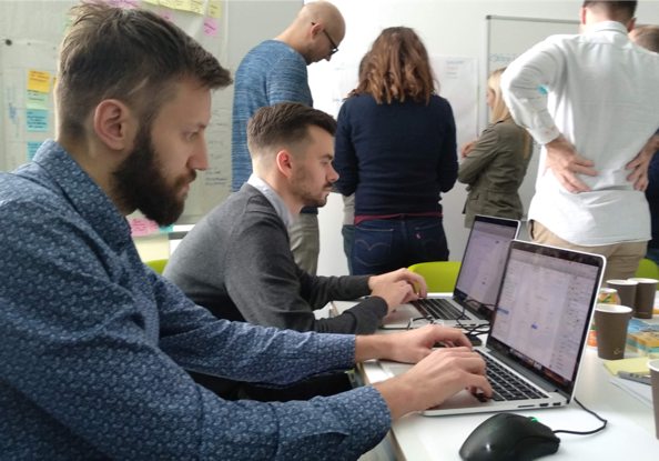
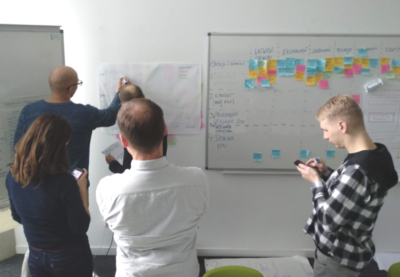
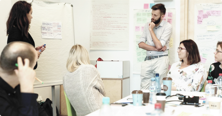
During our first kick-off meeting we discussed further steps and marked areas to explore. We worked closely with the team, diving deeply into better understanding and immersion of the project.

research & discovery
Are we trying to solve a real problem?

ux strategy from scratch
How to create an easily accessible product

create a solid value proposition
What is the real value behind the product?

increase user experience by workshops
Create a proper communication style


design process
This startup started with a 5 days long design sprint
Starting only with a scratch of idea we needed to prove that this direction is worth investing.
We gathered all the important stakeholders in one place
to create and verify a digital prototype in one week.
- Discovery
- Ideation
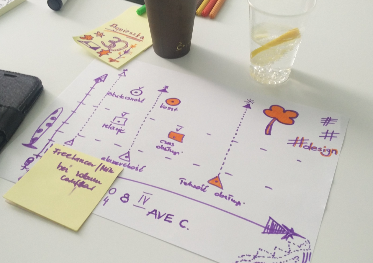
- Sketching
- design & prototype
- user testing

The entire process of going from a problem or business need through a concept and finally to release and gathering user’s feedback.
effects
How the MVP Prototype looked like? (created within 1 day)
Let's get back to project beginning.
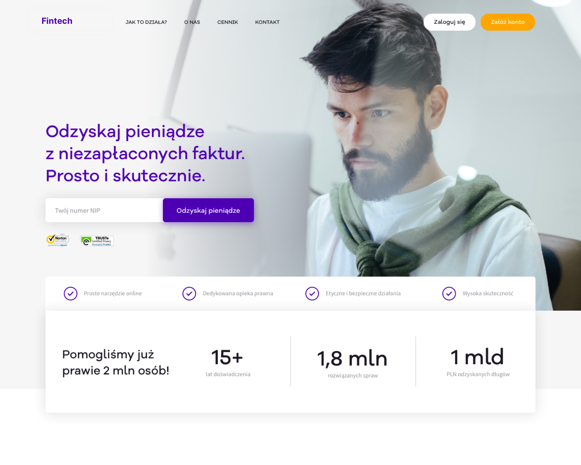
In just 5 days we had all the answers that helped us to make a decision of launching a new product. Those are design just after a Design Sprint.
Just after the Design Sprint Product owner went to a board meeting with a new knowledge from user testing phase. We were waiting for yes / no decision for further development.
What were the main identified features during user tests?
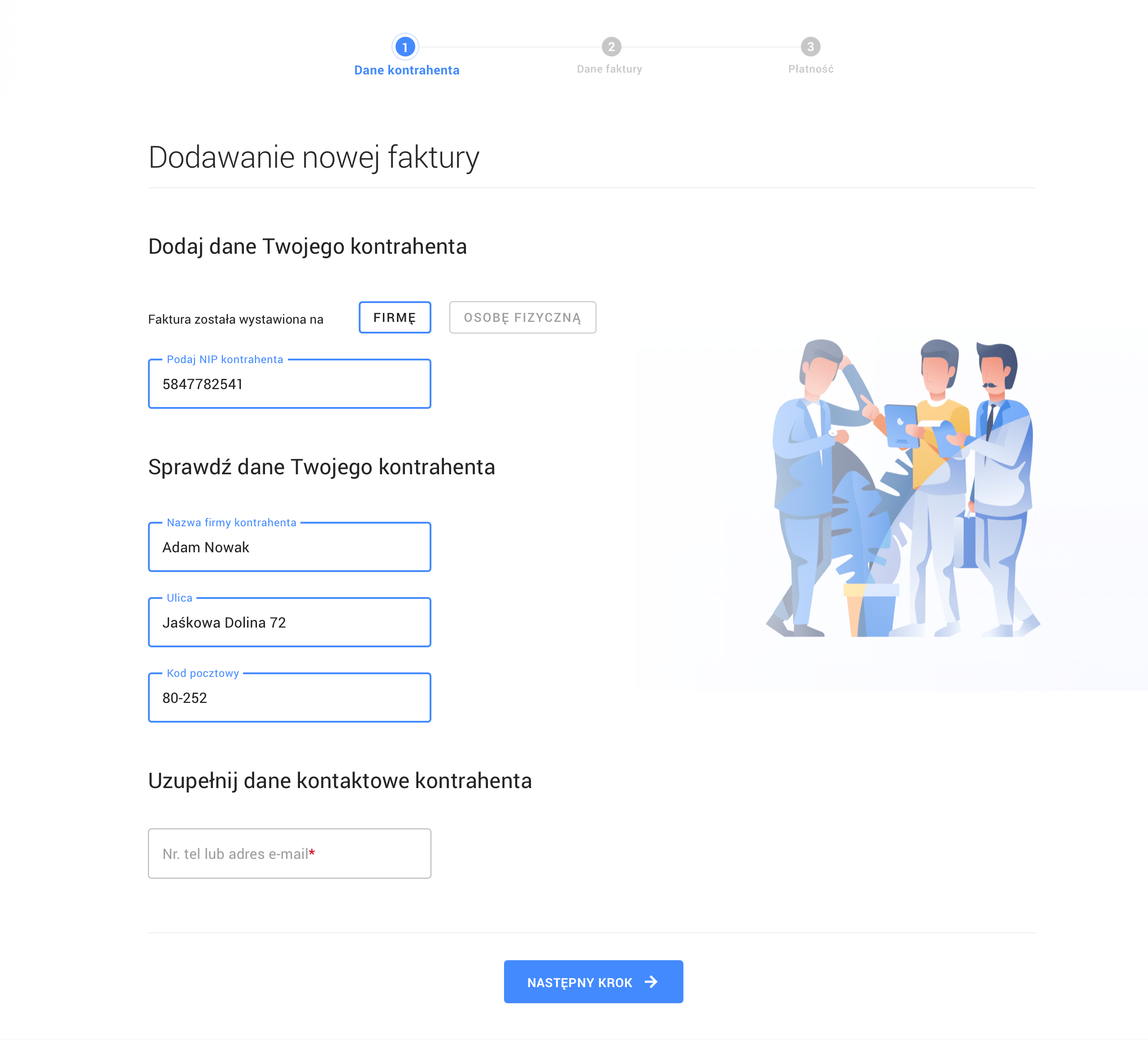
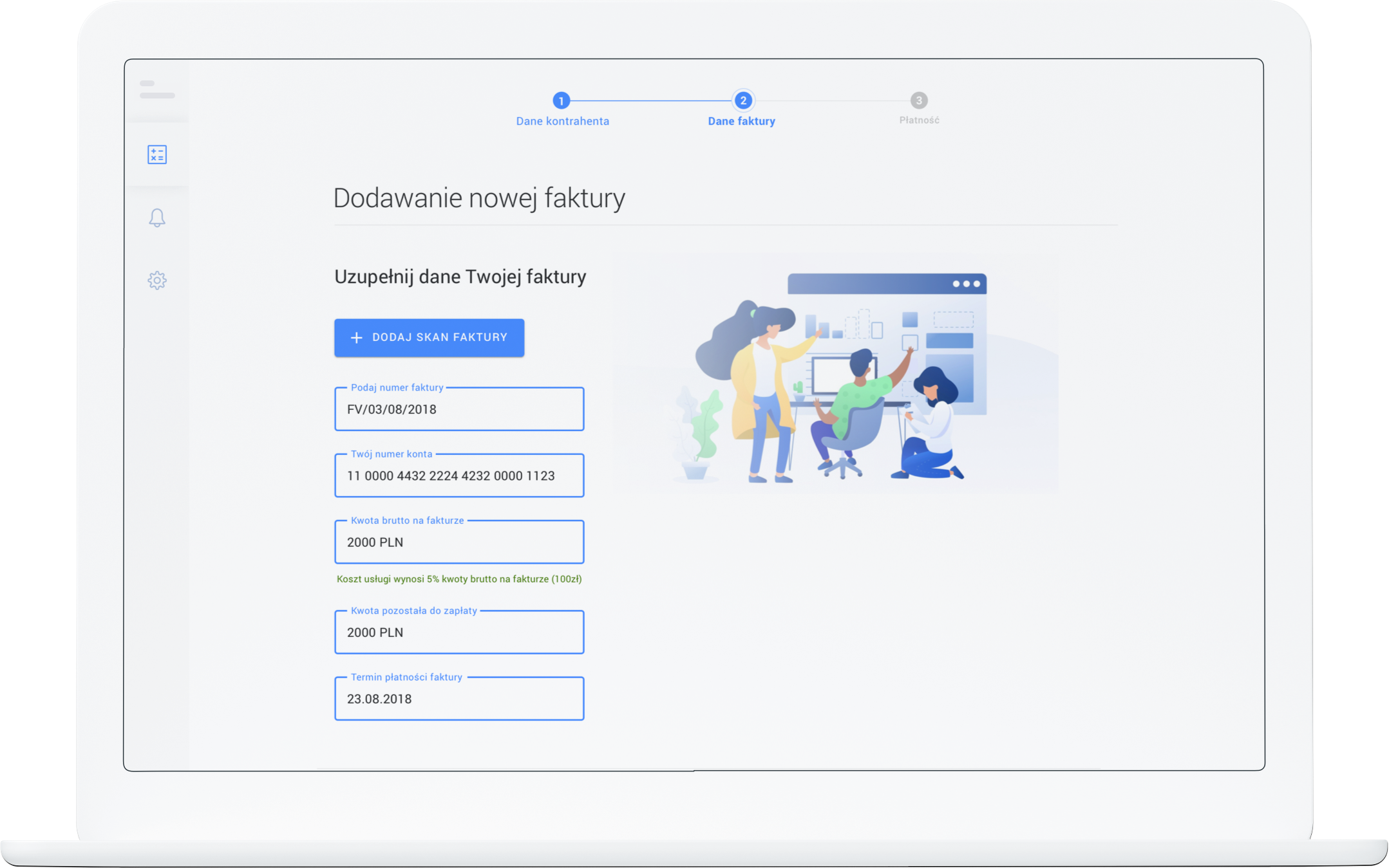
Friendly & Fast Invoice Adding
When thinking about adding new invoices we looked for the most user friendly and quick way to complete the process. That's why we decided to divide it into 3 steps - contractor data, invoice details and payment for the service. That way user doesn't get overwhelmed by too
Whole project cost consumes a lot of time and energy. Unclear requirements make estimation and valuation difficult. Creative process require a lot of dialogue. Understanding many channels might be a hassle. Clear task delegation, obvious responsibilities and comprehensive definition of done - these are every manager challenges.
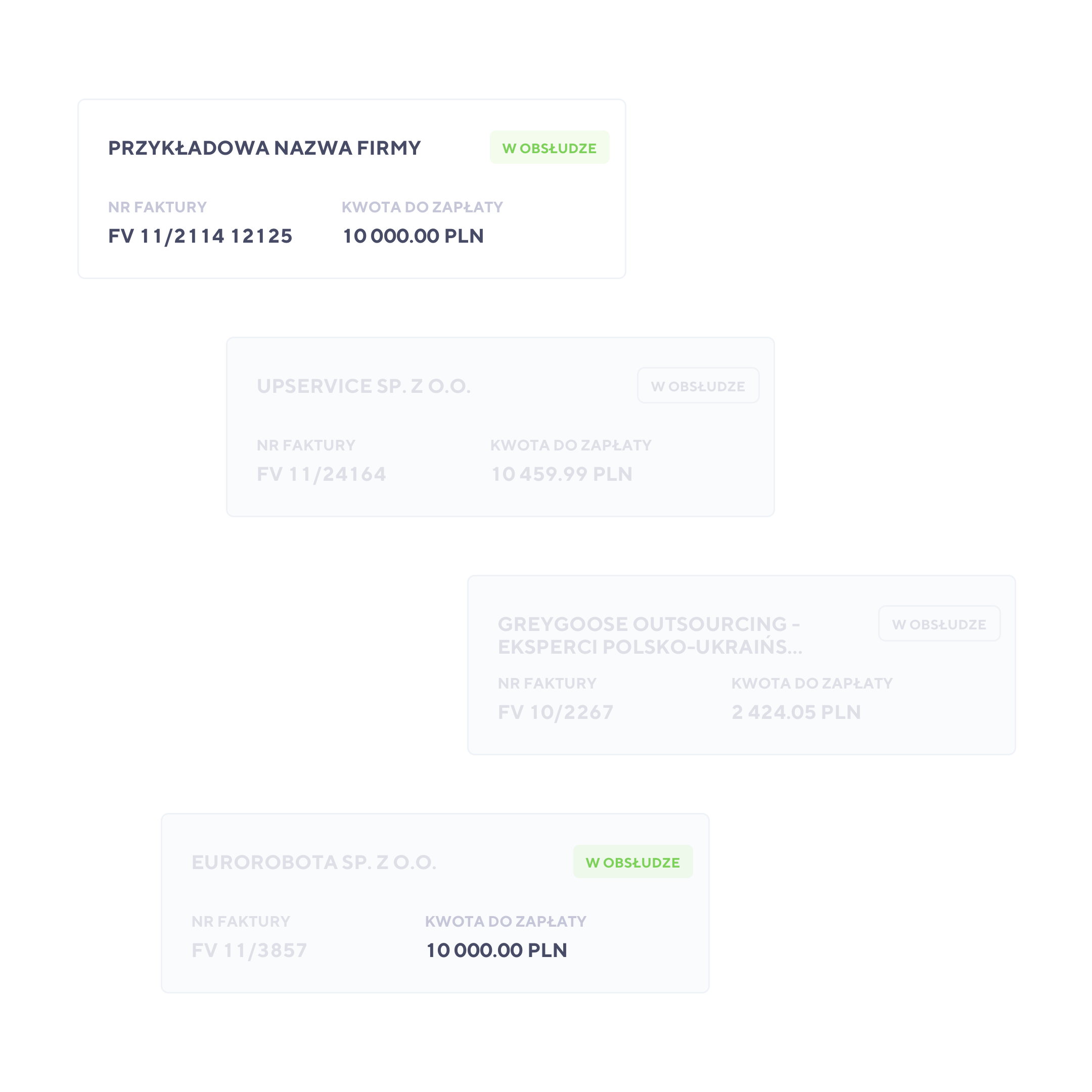
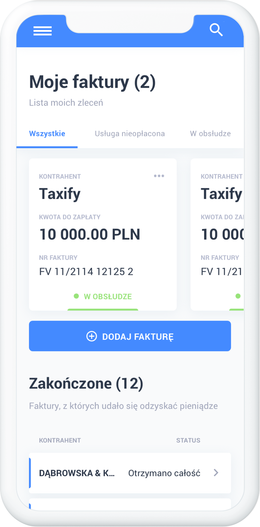
Easy Navigation Between Invoices
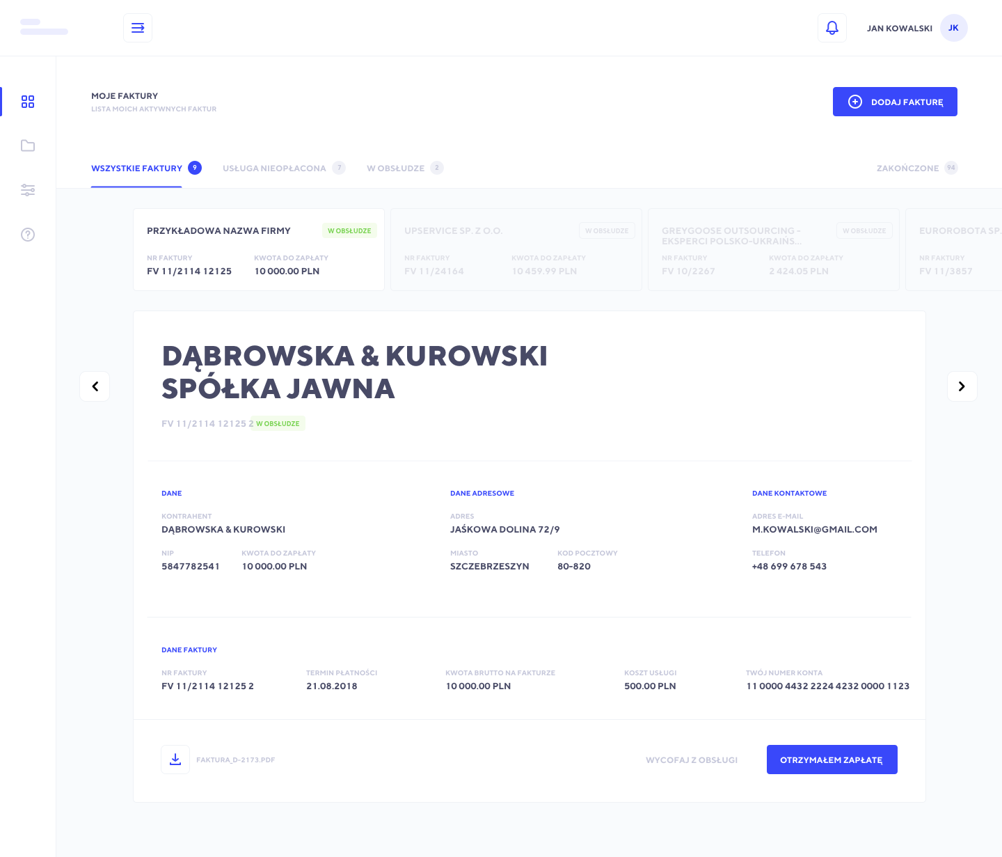
One of our goals was to design a platform that is easy to use right at the first sight. We understood how valuable it is to have a clear overview of the paymenent status and to be able to react quickly.
As for the entreprenuers, keeping it all simple and in one place helps manage their business and not waste time on annoying tasks.
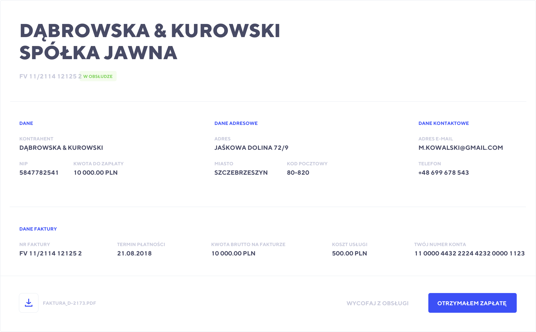
Big, Clear Invoices for a Quicker Overview
Entreprenuers hate wasting their precious time. We kept in mind that fact when approaching the design of invoices.
Our priority was to keep everything clear and clean. Large headline helps identifying contractors and carefully thought layuot makes it easy to notice the most important data.

15
user tested4
months - project length150+
screens designed
Movade - Portfolio showreel from 2019
We are Product Design Studio - we translate your business goals and objectives into insightful UX, remarkable UI and distinctive visual concepts. Let do great product together.


